Floral Rangoli With Gradient Colors: Stunning Designs for Every Occasion
Floral rangoli with gradient colors turns a flat flower pattern into art that seems to glow from within. I have made these designs for years at my doorstep. Once you learn the color blending, every petal looks alive.
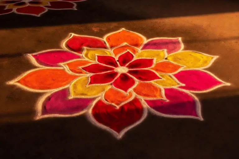
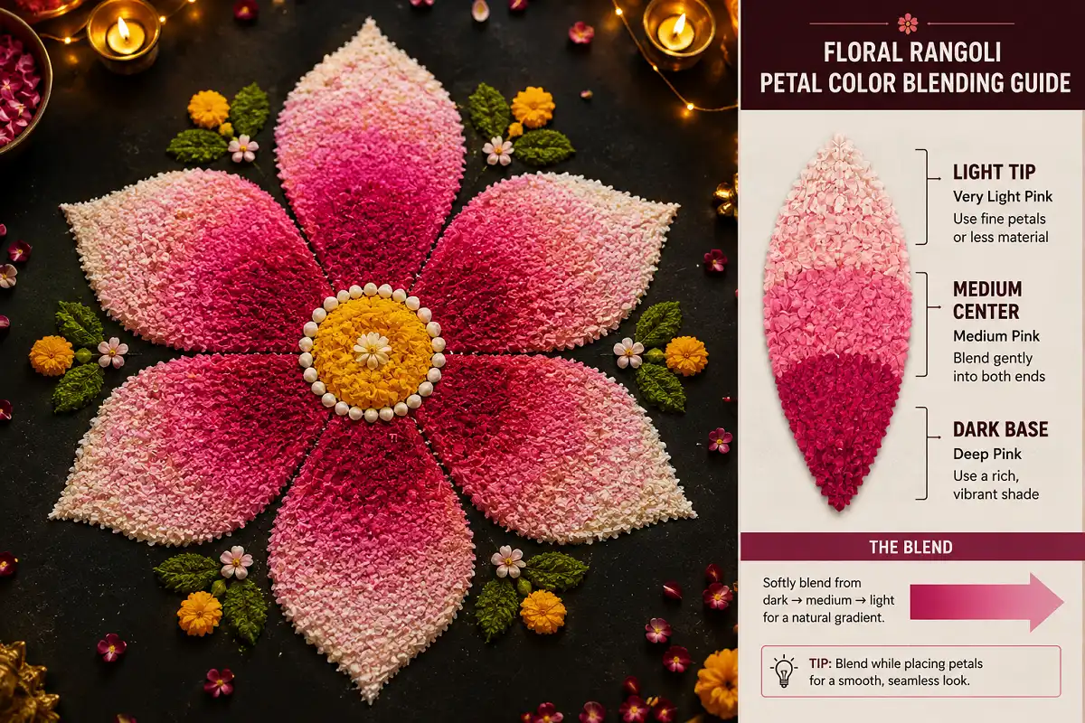
Floral rangoli with gradient colors uses smooth shade transitions inside flower petals, moving from dark to light. You blend two or three tones per petal with your fingertip. This creates depth, softness, and a three-dimensional look on the floor.
What Is Floral Rangoli With Gradient Colors?
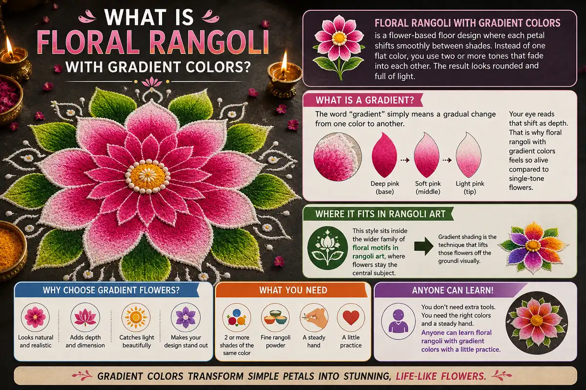
Floral rangoli with gradient colors is a flower-based floor design where each petal shifts smoothly between shades. Instead of one flat color, you use two or more tones that fade into each other. The result looks rounded and full of light.
The word “gradient” simply means a gradual change from one color to another. In a petal, you might start with deep pink at the base. Then it softens to light pink at the tip. Your eye reads that shift as depth. That is why floral rangoli with gradient colors feels so alive compared to single-tone flowers.
This style sits inside the wider family of floral motifs in rangoli art, where flowers stay the central subject. Gradient shading is the technique that lifts those flowers off the ground visually. You do not need extra tools. You need the right colors and a steady hand. Anyone can learn floral rangoli with gradient colors with a little practice.
Why Do Gradient Colors Make Flowers Look Better?
Gradient colors make flowers look better because real petals are never one flat shade. Look at a rose or a marigold up close. The color deepens near the center and lightens at the edges. Gradient rangoli copies that natural effect, so the flower reads as real.
Flat color fills space. Gradient color creates form. When you blend a dark base into a light tip, you trick the eye into seeing a curve. That curve is what gives your rangoli a soft, rounded, almost glowing quality. This is the core reason floral rangoli with gradient colors has become so popular for festivals and competitions. Judges and guests both notice the depth right away.
There is a practical benefit too. Gradients hide small mistakes. A slightly uneven petal edge disappears once the colors blend. Beginners find this forgiving. That makes the style welcoming for anyone starting out.
What Materials Do You Need for Gradient Floral Rangoli?
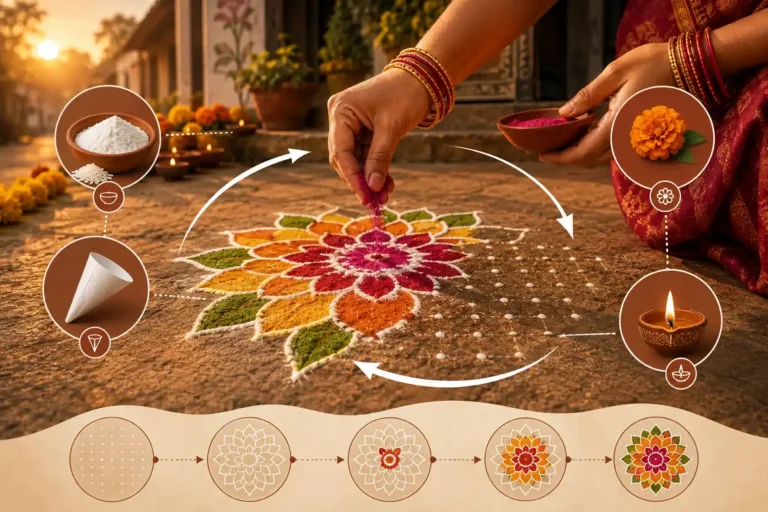
You need loose rangoli powder in graded shades, a base outline tool, and your fingers for blending. Fine powder blends better than coarse grain. Buy or mix three tones of each main color: a dark, a medium, and a light version. The materials stay simple and inexpensive.
Here is what I keep ready on my tray:
Rice flour and colored sand both work as a base. Many practitioners of traditional rangoli made with rice flour use it because it grips the floor and blends smoothly. For outdoor festival work, colored sand holds up better against wind.
How Do You Create a Gradient Effect in Rangoli Petals?
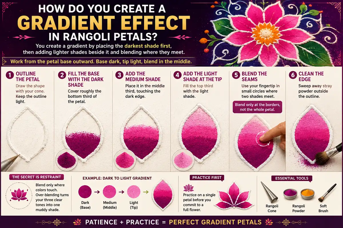
You create a gradient by placing the darkest shade first, then adding lighter shades beside it and blending where they meet. Work from the petal base outward. The base stays dark. The tip stays light. The blend happens in the middle third. This single skill is the heart of floral rangoli with gradient colors.
Follow these steps for one petal:
-
Outline the Petal
Draw the shape with your cone. Keep the outline light.
-
Fill the Base With the Dark Shade
Cover roughly the bottom third of the petal.
-
Add the Medium Shade
Place it in the middle third, touching the dark edge.
-
Add the Light Shade at the Tip
Fill the top third.
-
Blend the Seams
Use your fingertip in small circles where two shades meet. Blend only at the borders, not the whole petal.
-
Clean the Edge
Sweep away stray powder outside the outline.
The secret is restraint. Blend only where colors touch. Over-blending turns your three clear tones into one muddy shade. Practice on a single petal before you commit to a full flower.
What Are the Best Color Combinations for Gradient Flowers?
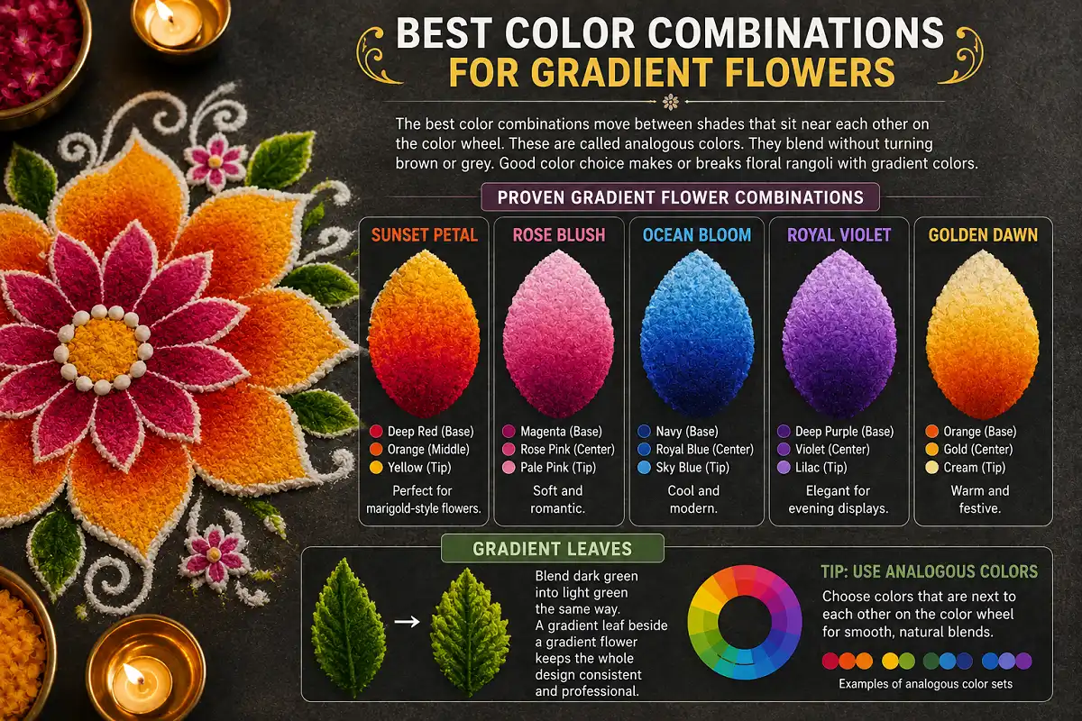
The best color combinations move between shades that sit near each other on the color wheel. These are called analogous colors. They blend without turning brown or grey. Pink to orange, purple to blue, and yellow to orange all look natural. Good color choice makes or breaks floral rangoli with gradient colors.
Here are combinations I return to again and again:
Deep red at the base, orange in the middle, yellow at the tip. Perfect for marigold-style flowers.
Magenta base, rose pink center, pale pink tip. Soft and romantic.
Navy base, royal blue center, sky blue tip. Cool and modern.
Deep purple base, violet center, lilac tip. Elegant for evening displays.
Orange base, gold center, cream tip. Warm and festive.
For leaves, blend dark green into light green the same way. A gradient leaf beside a gradient flower keeps the whole design consistent. If you enjoy working with warm tones, a marigold rangoli design with layered shades is a natural next project. The sunset palette suits it perfectly.
Which Flowers Work Best for Gradient Rangoli?
Flowers with clear, separate petals work best because each petal gives you room to blend. Lotus, rose, marigold, and hibiscus all have bold petal shapes. Tight cluster flowers are harder because the petals crowd each other.
The lotus is my favorite for this style. Its long petals give plenty of space for a full dark-to-light shift. A gradient lotus looks serene and dimensional. Many readers start with lotus rangoli design ideas and then add shading once the basic shape feels comfortable.
The rose comes second. Its curved petals suit soft pink and red blends. The marigold works well too, with its rounded, layered look. For a bold statement, hibiscus petals take a striking red-to-orange gradient. Pick a flower with petals you can draw confidently. The shading only helps if the shape underneath is clean. The best flowers for floral rangoli with gradient colors always have open, separate petals.
How Do You Plan a Full Gradient Floral Rangoli Design?
You plan a full floral rangoli with gradient colors by choosing a center point, deciding your flower count, and mapping your color flow before you touch any powder. A clear plan stops you from running out of a shade halfway. Sketch the layout first, even a rough one.
Start with the center. A single large gradient flower in the middle anchors the whole piece. Around it, place smaller flowers or petals in a ring. Keep the color story consistent. If your center flower runs red to yellow, your outer flowers should share at least one of those tones.
Think about balance. A gradient design already carries a lot of visual weight. Leave some open floor space so the eye can rest. Borders work well here. A simple gradient border frames the flowers without competing. For festival displays, I often connect the flowers with thin curved vines in a single mid-tone. This ties everything together without adding more gradients.
Size your design to your space and your time. A small three-flower gradient rangoli takes about thirty minutes. A large competition piece can take hours. Match your ambition to your available time so you finish cleanly.
What Occasions Suit Gradient Floral Rangoli Best?
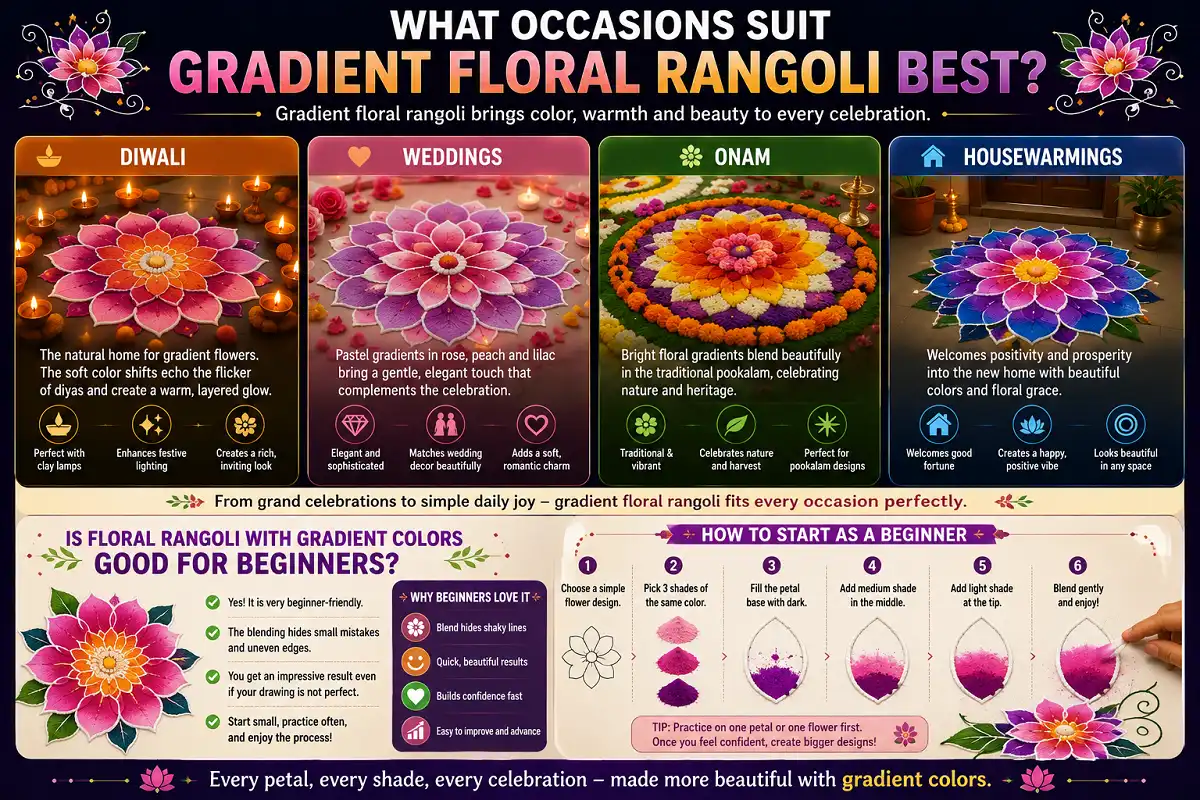
Gradient floral rangoli suits any celebration that calls for color and warmth. Diwali, weddings, Onam, and housewarmings all shine with these designs. The glowing petals match the festive mood of lamps and lights.
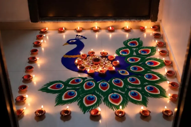
Diwali is the natural home for this style. Gradient flowers beside clay lamps create a warm, layered glow. The soft color shifts echo the flicker of the diyas. For a wedding, pastel gradients in rose and lilac feel gentle and elegant. During Onam, bright flower gradients fit the traditional floral carpet, the pookalam.
These designs also work for everyday joy. A small gradient flower by your entrance lifts an ordinary day. You do not need a festival to make one. The style scales from a quiet daily bloom to a grand celebration centerpiece. That flexibility is why floral rangoli with gradient colors fits every occasion so well.
Is Floral Rangoli With Gradient Colors Good for Beginners?
Floral rangoli with gradient colors is very good for beginners because the blending hides small errors. A shaky petal edge disappears once the shades merge. You get an impressive result before your drawing is perfect. Start with one flower and three shades. Confidence builds fast from there.
How Do You Fix Common Gradient Mistakes?
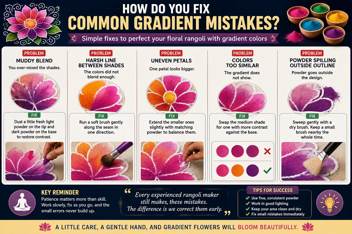
You fix most gradient mistakes by adding fresh powder on top rather than trying to scrape and restart. Rangoli powder layers easily. A muddy blend, a harsh line, or a wrong shade can all be corrected with a light new layer. Nobody makes floral rangoli with gradient colors perfectly on the first try.
Here are the problems I see most, and the fix for each:
-
Muddy Blend
You over-mixed the shades. Dust a little fresh light powder on the tip and dark powder on the base to restore contrast.
-
Harsh Line Between Shades
The colors did not blend enough. Run a soft brush gently along the seam in one direction.
-
Uneven Petals
One petal looks bigger. Extend the smaller ones slightly with matching powder to balance them.
-
Colors Too Similar
The gradient does not show. Swap the medium shade for one with more contrast against the base.
-
Powder Spilling Outside the Outline
Sweep gently with a dry brush. Keep a small brush nearby the whole time.
Patience matters more than skill here. Work slowly, fix as you go, and the small errors never build up. Every experienced rangoli maker still makes these mistakes. The difference is we correct them early.
Tips to Make Your Gradient Flowers Look Professional
Professional-looking gradient flowers come from clean outlines, controlled blending, and good contrast. These three habits separate a polished design from a messy one. None of them require expensive materials. Great floral rangoli with gradient colors depends on technique, not costly tools.
-
Always Outline Before You Fill
A crisp petal edge makes even a simple gradient look intentional.
-
Blend Only at the Seams
Never the whole petal. This keeps your shades distinct and your flower dimensional.
-
Choose Shades With Real Contrast
If your dark and light are too close, the gradient vanishes.
A few finishing touches lift the whole piece. Add a tiny white dot or a bright center to each flower for a highlight. Edge your petals with a thin darker outline once the blend is done. This sharpens the shape. For evening displays, place small lamps or tea lights around the design. Warm light makes gradient colors look even richer. If you want more inspiration for combining shades and shapes, browsing a gallery of creative rangoli designs to love can spark fresh ideas for your own gradient work.
The Cultural Roots of Colored Floral Rangoli
Floral rangoli belongs to a floor-art tradition that stretches back centuries across India. The practice of decorating thresholds with colored patterns is documented in the broad history of rangoli as a folk art form. Flowers have always been central to it, from fresh-petal carpets to powder designs.
Gradient shading is a newer creative layer on this old base. Traditional rangoli often used flat, bold color blocks. Modern makers began blending shades to add realism and depth. This shift shows how a living tradition keeps growing. The roots stay the same. The techniques keep evolving. Floral rangoli with gradient colors is one of the freshest expressions of that ongoing change.
Final Words
Floral rangoli with gradient colors rewards patience more than talent. Master the single-petal blend first. Then build up to full flowers and complete designs. Keep your shades close, blend only at the seams, and always outline before you fill.
Start small, fix mistakes as they come, and your flowers will soon look like they glow. With practice, floral rangoli with gradient colors will become your signature style. Every doorstep deserves one beautiful bloom.